SplitContainer
The SplitContainer component provides a card-like container with a header and two side-by-side content areas separated by a border. It's responsive and automatically stacks vertically on mobile devices, making it perfect for displaying paired content or comparison views.
Preview
On Desktop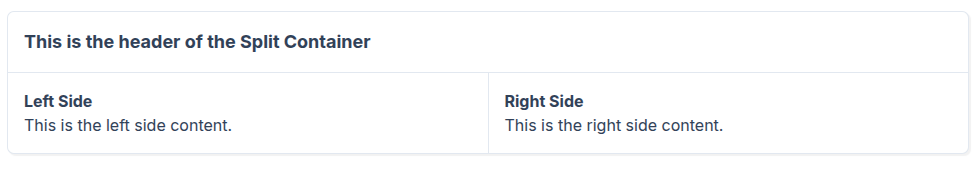
On Mobile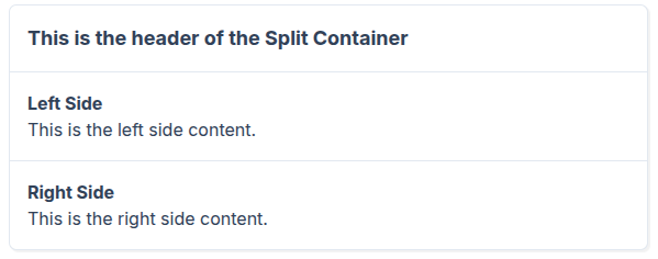
vue
<template>
    <div class="p-4">
        <SplitContainer>
            <template #header>
                <h2 class="text-lg font-bold">This is the header of the Split Container</h2>
            </template>

            <template #left>
                <div class="p-4">
                    <h3 class="text-md font-semibold">Left Side</h3>
                    <p>This is the left side content.</p>
                </div>
            </template>

            <template #right>
                <div class="p-4">
                    <h3 class="text-md font-semibold">Right Side</h3>
                    <p>This is the right side content.</p>
                </div>
            </template>
        </SplitContainer>
    </div>
</template>
Props
This component has no props - it uses slots for all content.
Slots
| Slot | Description |
|---|---|
header | Content for the header section at the top |
left | Content for the left pane (or top pane on mobile) |
right | Content for the right pane (or bottom pane on mobile) |
Usage
Basic Implementation
Create a simple split container with header and two content areas:
vue
<template>
  <SplitContainer>
    <template #header>
      <h2>My Split Container</h2>
    </template>
    <template #left>
      <p>Left pane content</p>
    </template>
    <template #right>
      <p>Right pane content</p>
    </template>
  </SplitContainer>
</template>
Responsive Behavior
The component automatically adapts to screen size:
- Desktop (≥768px): Two columns side-by-side
- Mobile (<768px): Single column, stacked vertically (left on top, right below)
Layout Structure
Desktop:
┌─────────────────────────────────┐
│         Header Slot             │
├────────────────┬────────────────┤
│                │                │
│   Left Slot    │   Right Slot   │
│                │                │
└────────────────┴────────────────┘
Mobile:
┌─────────────────────────────────┐
│         Header Slot             │
├─────────────────────────────────┤
│          Left Slot              │
├─────────────────────────────────┤
│         Right Slot              │
└─────────────────────────────────┘